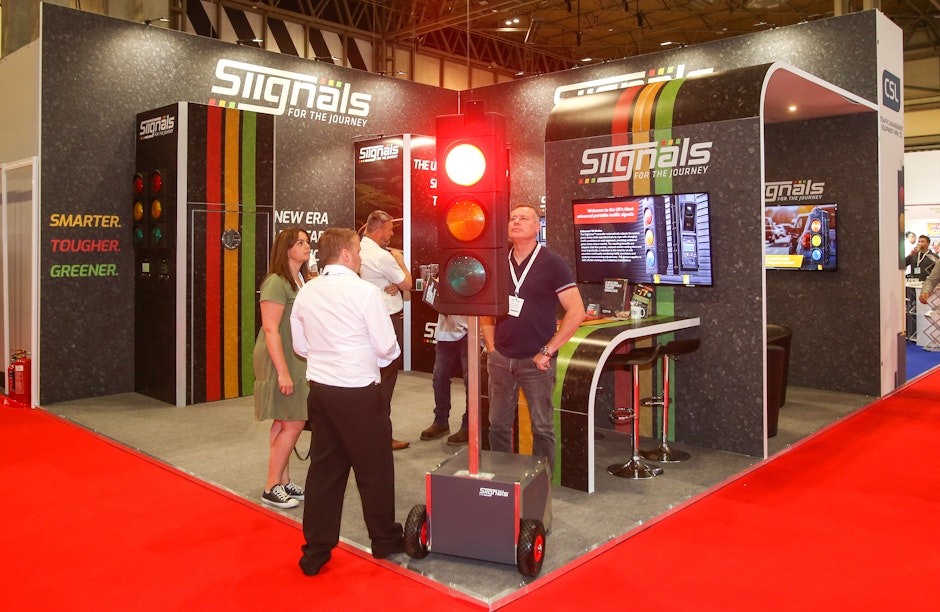
In order to create the best possible display stand – such as a banner or pop up display – you need to submit quality artwork before the display is printed. If you’re new to this it can be difficult to design something from scratch, so here’s a few pointers on how to create a breathtaking promotional display for your business!

The Anatomy of a Display Stand
The layout of a display stand can help people interpret your marketing message more easily. You can do this by following this widely-seen layout:
1. Keep it simple
Display stands are often placed in high-traffic locations such as exhibition halls and reception areas, and as such usually aren’t looked at by passers-by for a long period of time.
Whilst you may want to list all the best things about your organisation, a display stand should be designed as an at-a-glance overview of your company, with the biggest focus on your logo and illustrative pictures rather than text.
2. Use relevant high resolution images
Images are a vital part of any stand design: if a low-resolution image is supplied, the final display will be blurry and look unprofessional. To avoid this, you need to make sure the images you submit are a minimum of 25% of the finished size, at least 300 DPI and in CMYK format.
This type of high-resolution image isn’t usually available by copying an image from your website, so it’s best to use photographs taken with a high-resolution digital camera (preferably by a photographer). Ideally you should hire a photographer to take a number of high-quality images that you can use across your marketing campaigns.
Be careful if using stock image sites such as Shutterstock: stock images will often do very little to communicate the ‘feel’ of your brand and appeal to your audience, as they are of course designed to be widely appropriate and not specific to your audience. You may even find somebody else using exactly the same image as you!
Often designing trade show signage without Photoshop or other graphics software can be a real hassle, so if this is the case you may be better having the supplier design the stand for you.

3. Answer customer questions
If you’ve exhibited at a trade show before, you have probably noticed that many prospects ask similar questions about your product/service.
Use your trade show banner to answer a few of these key questions in bullet points, this way when the prospect speaks to your sales team they will already have some background knowledge and you can start to tailor a specific pitch for their needs.
4. Make sure they remember you
List all of you company’s contact details at the bottom of the display so people can easily get in touch once they understand what your company is offering. If you are on social media it might be a nice touch to add those in too.
5. Colour it in
Colour is a key consideration when designing any type of display-to-go so make sure you think carefully about the best colour scheme for your marketing message. Different colours evoke different responses in people, so make sure you know what response you want before you design your stand.
For example, an unknown start-up business exhibiting at a new event might utilise brighter colours such as red, orange or yellow to attract new business, while a more established business might choose calming, authoritative colours such as blue or green to give off a professional tone.
We’d recommend using tools like paletton.com to help generate a cohesive colour scheme that works beautifully together and doesn’t clash. These types of tools will provide you with fitting colours schemes of any number of colours, and will provide the colour tables and HEX values so you can show off and easily use your flash new hues!

6. Follow brand guidelines
If you work for a larger company or organisation, you may already have brand guidelines which you have to follow. Even if you haven’t got these yet, you may have created other printed promotional material such as a company brochure which can help you with inspiration for your display.
Maintaining similar design elements throughout your promotional material will give your organisation a consistent brand identity, making it more recognisable as time goes on.
Summing Up
Be noticeable.
Be concise.
Be consistent.
Be informative.
If you follow all these steps, your stand will certainly attract attention. If you still need help designing your display stand, get in touch with Display Wizard’s in-house graphic design team who can design your printed display stand for you.


