Six seconds. That’s how long the average trade show attendee will spend looking
at your trade show display before they choose to interact with your sales team or walk on to the next exhibit.
Since you have such a short time to make an impression, the design of your trade show display can make a huge difference to the amount of attention – and sales – your company gets when it exhibits at a trade show.
In this quick guide, we’ll cover the basics of effective design for pop up trade show displays. Read on to learn more about how you can make sure your display catches eyes and makes an impression at your next trade show.
Pop up displays: What you should know as a designer
Since pop up displays are available in a variety of different sizes and shapes, you’ll need to factor visibility into your design.
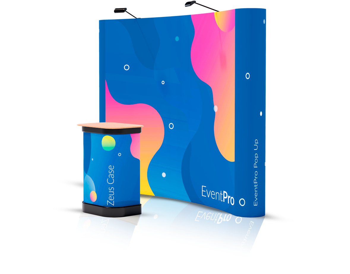
Most pop up displays consist of several centre panels and D-shaped end panels. The end panels wrap around the stand and give it an eye-catching curved design. Before you finalise your design, you’ll need to take these curves into account.
Why? Because using the same design as you would for a banner stand can result in visibility issues. The D-end panels at either side of your display are visible from the rear, the side and the front, making complicated designs difficult for people to see.
If you’d like to extend your design onto the D-end panels at either side of your pop up display, it’s best to divide the entire panel into thirds. Our curved pop up artwork requirements guide explains D-end panel design and visibility in greater detail.
Dimensions and structure: How pop up stands work
Pop up display stands are available in a variety of different sizes. The most common sizes are 3×1, 3×2, 3×3, 3×4 and 3×5.
Note that there’s no ‘m’ after each of those common sizes, as pop up displays aren’t measured in metres. Instead, each of the dimensions refers to the number of quads that make up the structure of the stand.
Each quad is a square supportive structure that makes up the stand. A 3×1 display stand is three quads high and one quad across, while a 3×5 is three quads high and five quads across.
Choosing the right size of display stand is vital for trade show success. If you want to make an impression, a bigger pop up display – for example, a curved 3×4 display – is a great tool for catching the attention of attendees and standing out.
Creating an eye-catching, stylish design
Your display is the first thing that most attendees will notice about your business, so it’s important to design it properly. While your design is ultimately up to you, there are some simple tips and tactics that can help you get the most from your display.
First, remember that your display’s goal is to capture attention and tell people about the core benefits, features and values of your business. It isn’t an in-depth marketing tool – that’s a job that’s best handled by your printed material and sales reps.
Keep your message straightforward and simple, and focus on designing something eye-catching and interesting rather than in-depth and persuasive. Your display is a tool for getting people to notice you, not closing sales on its own.
Selling the benefits, not just the features
It’s tempting to sell your product or service based on its features – new technology or a capable, experienced team. When you’re designing an eye-catching trade show display, however, you need to focus on selling the benefits first and the features later.
Remember that you’re probably not going to be the only company at the trade show offering your particular product or service. Your competitors will be there too, each with their own displays listing their product’s top features.
Focus on what makes you a better choice and make this the focus of your display. A great benefit will impress attendees and entice them to come to your exhibit, giving your sales team a greater amount of foot traffic to market to.
Avoiding design issues with panel joins
Pop up display banners are lined up and cut by hand to ensure a seamless transition from one panel to the next. When your text is large and your logos confined to each individual panel, this looks fantastic and really makes your branding stand out.
When your text is small, lengthy and detailed and your graphics spread across more than one panel, however, readability can become an issue. When you’re designing your display, keep the dimensions in mind and try to confine your logos and text to each individual panel for maximum clarity.
Be consistent and make sure your brand shines through
Trade show displays don’t exist in isolation. After a prospect interacts with you at an event, they’ll probably follow up by looking at your company’s website and branding materials.
Keep your trade show display’s colour scheme and basic design consistent with your existing branding and you’ll create a smooth transition from the event to your sales process, increasing your lead-to-customer conversion rate in the process.
Don’t know what you need? Contact us today
Choosing the right type of trade show display isn’t always easy. From designs and dimensions to branding and sales, we’re here to help you make the right decisions for your next trade show or industry event.
posted in How To Guides
Share this Event


